We partnered with Bugle Creatives to create a website that empowers Booz Allen employees through improved information architecture, overall user experience and presentation of new and existing content in a beautiful way.
BEEMPOWERED WEBSITE
What We Delivered:
- Information Architecture
- User Experience
- User Interface Design
- Frontend Development
ABOUT THE TASK
Our task was to deliver a custom, redesigned portal that aligns people programs, platforms, investments, services, and resources with Booz Allen’s Empowerment strategy and architecture. Take the guesswork out of creative decisions by structuring the information architecture, content strategy, and user experience around data and common sense insights.
STRATEGY
Information Architecture was probably the largest undertaking for this project. For our strategy we needed to develop an information architecture that empowered employees and speaks in the language of the employee, not the business. Previous iterations of this site told the employee that “you are empowered” and also used a lot of organizational jargon that did nothing to communicate what they actually meant. We worked with leadership and stakeholders to understand the organizational goals for the site while developing a hierarchical information architecture that enabled the users of the site and actually showed employees they are empowered vs. telling them.
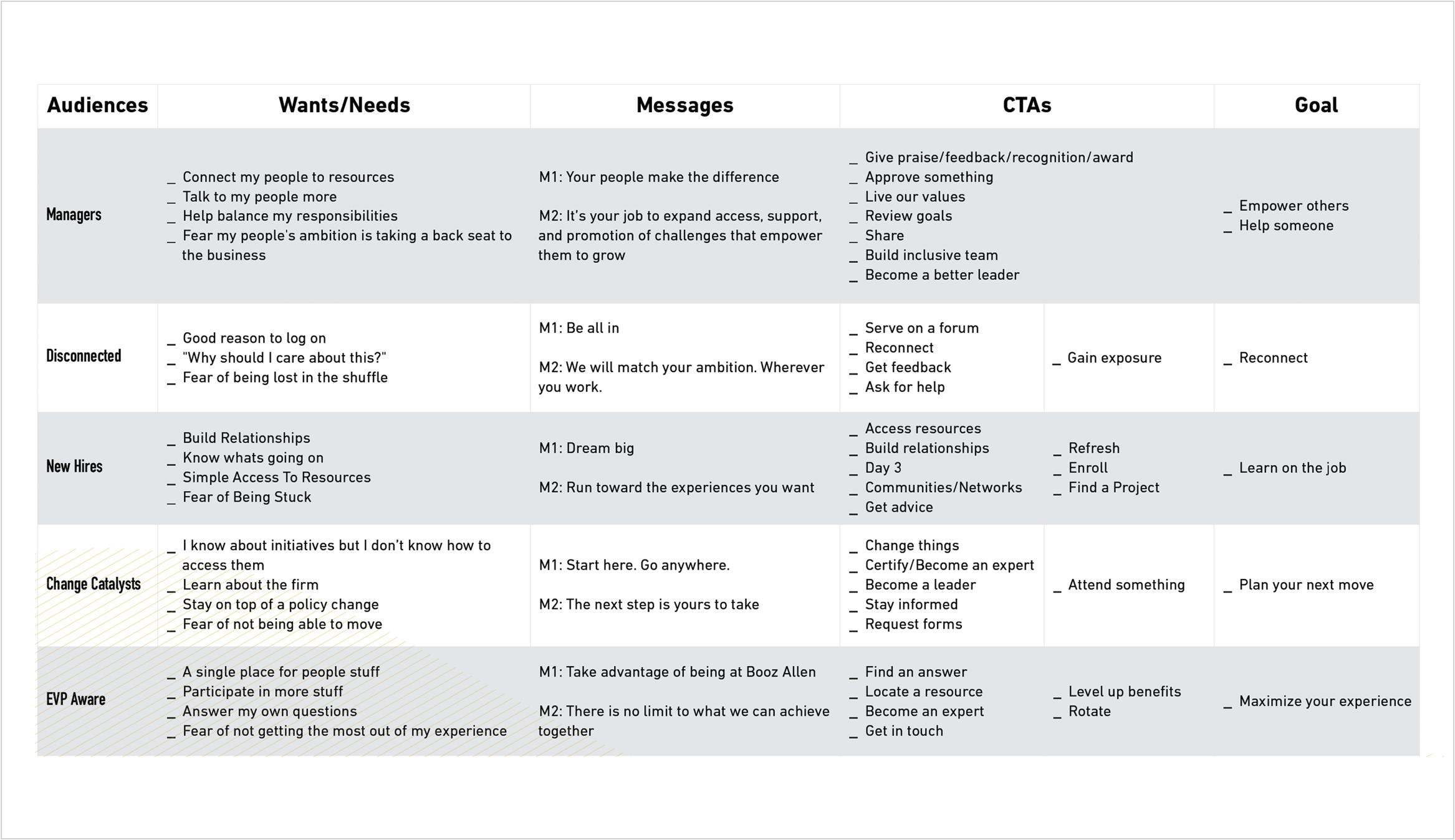
In order to develop an information architecture hierarchy that empowers employees we had to understand the wants and needs that drive each persona within the organization.
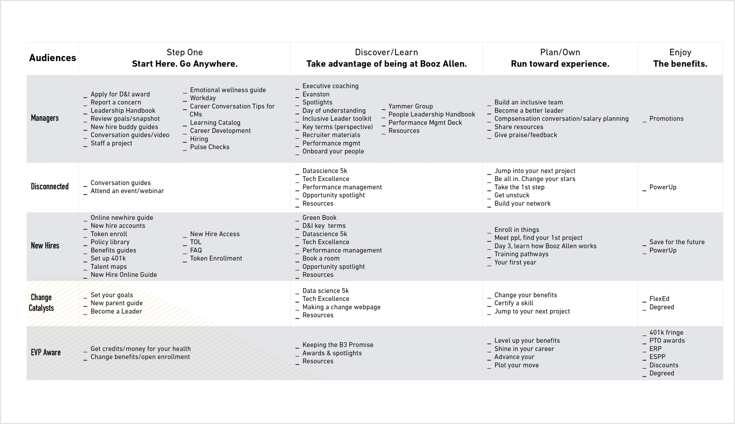
After we felt like we fully understood each unique persona and what drives them, we aligned each users wants and needs to goals, actions, and discreet resources that are available to them as employees
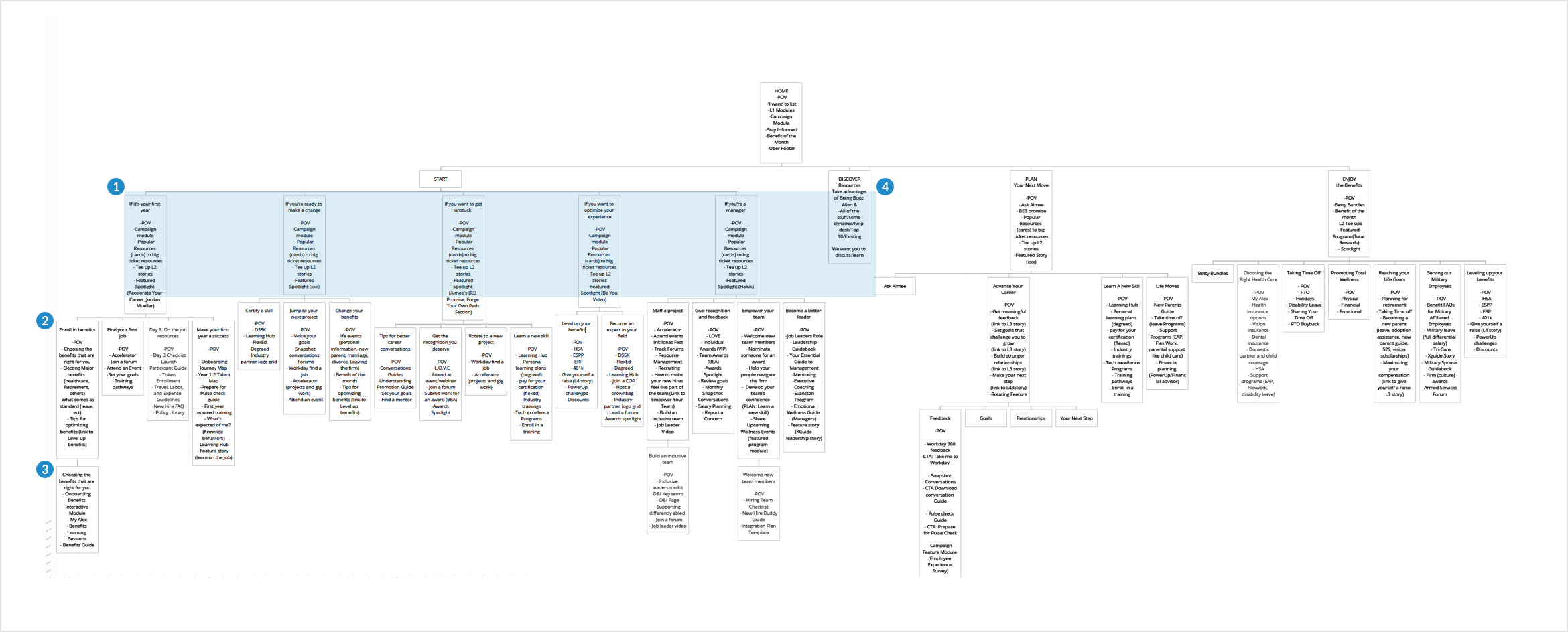
Above is the culmination of all of our research. This is the information architecture diagram we developed based on our research and strategy sessions to understand how employees should consume this information. We developed a system that worked on levels of depth based on our understanding of the personas (provided by Booz Allen). Level 1 is the top level of pages for the news site (1) this basically directly speaks to each persona lane we defined “Start here if you are…” The second level (2) branches off of level 1 and allows you to dive deeper into programs and resources based off of the first level i.e. “Start here if you’re a manger” would bring you to second level resources geared toward management and leadership. The third level (3) is the deepest level and is typically an in-depth article, person spotlight , or success story for that lane.
USER EXPERIENCE
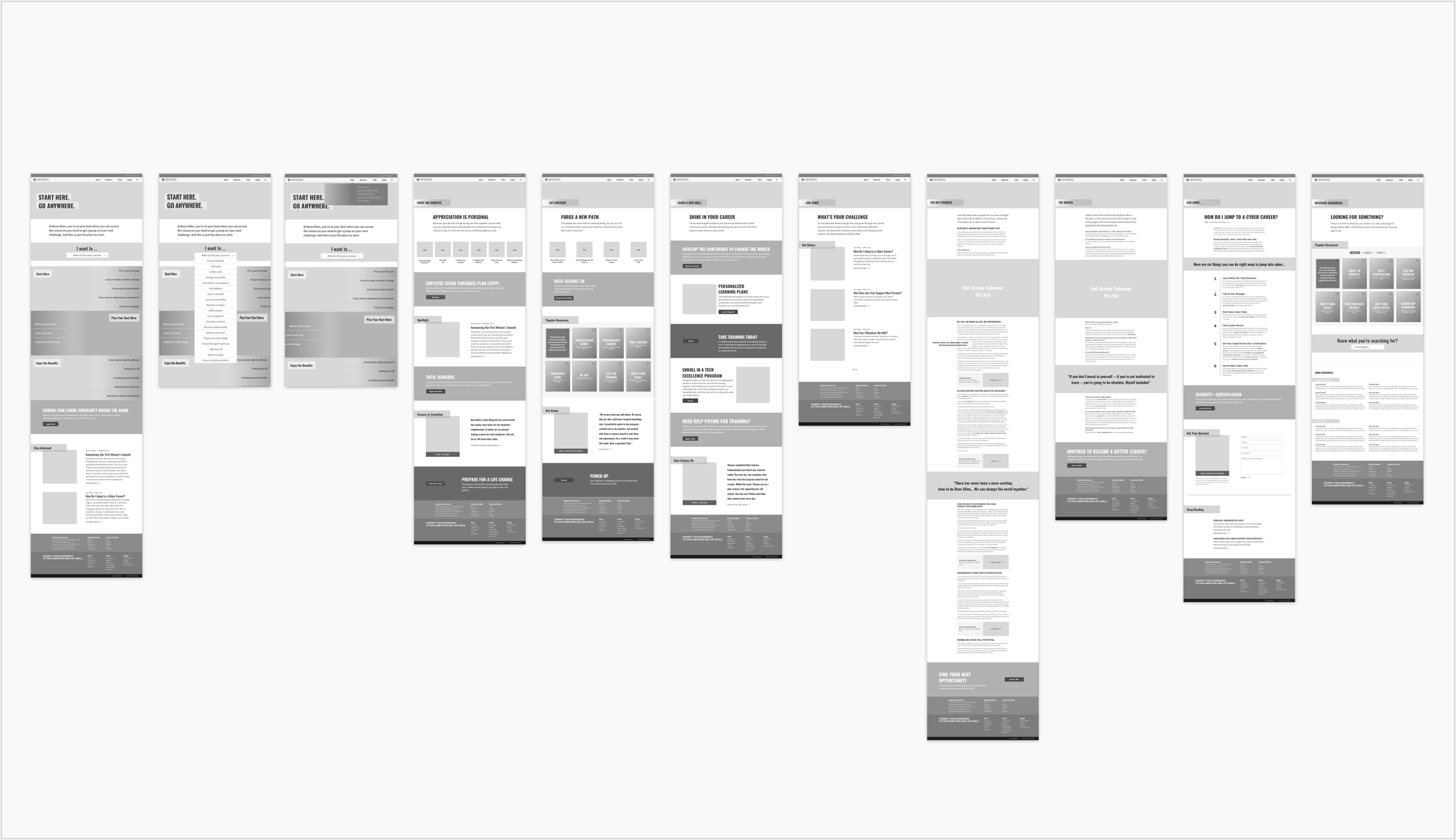
Our User Experience phase is fueled directly by our Strategy. We take the things we have learned from our strategy and develop wireframes that take into account users, personas, and the goals that drive them. Our wireframes are high fidelity, meaning that they take into account the exact layout, typography, and functionality choices that will drive the site and serve as a 1:1 template that we then build our design mockups from.
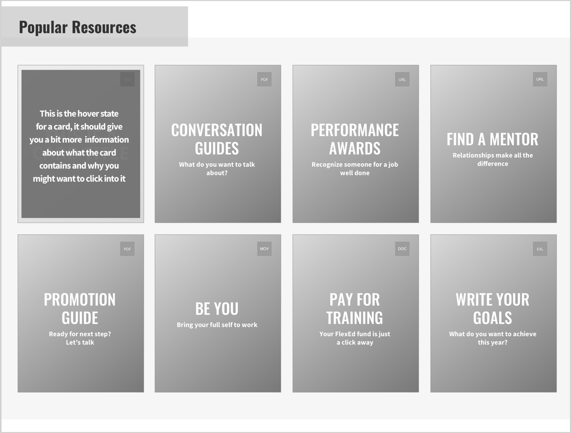
During our research we found that there were 100’s of resources available to employees with limited ways to access them out of search. Because we knew that all resources are valuable we developed a way to show between 8-16 resources at a time on any level 2 page. Each “card” had a short title, a type indicator (pdf, url, mov), and a hover state that showed small excerpt of what a user may find if they clicked this card. This integration of cards allowed just-in-time access to relevant information within an employee’s browsing experience vs. having to default to global search every time
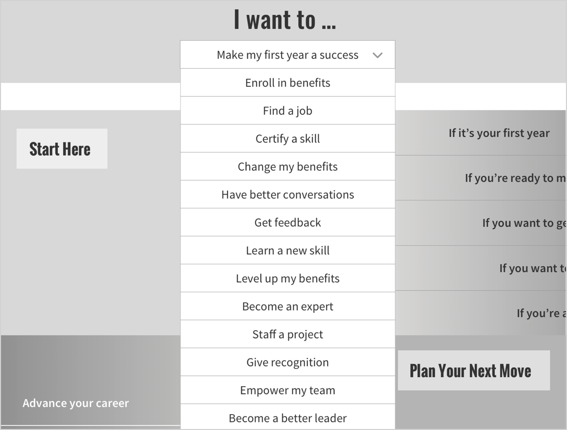
The “I want to” box allows an employee to jump directly to a level 2 page of their choosing without having to go through a level 1 page to get there. The way the homepage flows is that the user has the option to use the main navigation to go to a level 1 page, they can scroll down the page and jump to another level 1 page through the main boxes on the page, and this “I want to” dropdown which is a third way to get directly into the content and resources they are looking for.
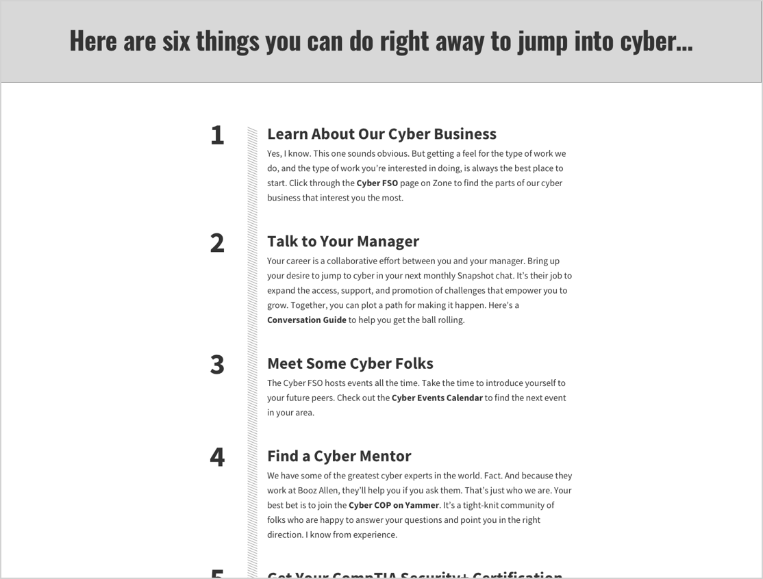
One unique artifact that come from our UX and Strategy research was the need for a new type of content. This type of content is list driven and is done in the style of an “Ask the Expert” article. This article was structured within the same grid as our editorial level 3 template but also had a unique design for the numbered list as seen here in the wireframe example.
USER INTERFACE DESIGN
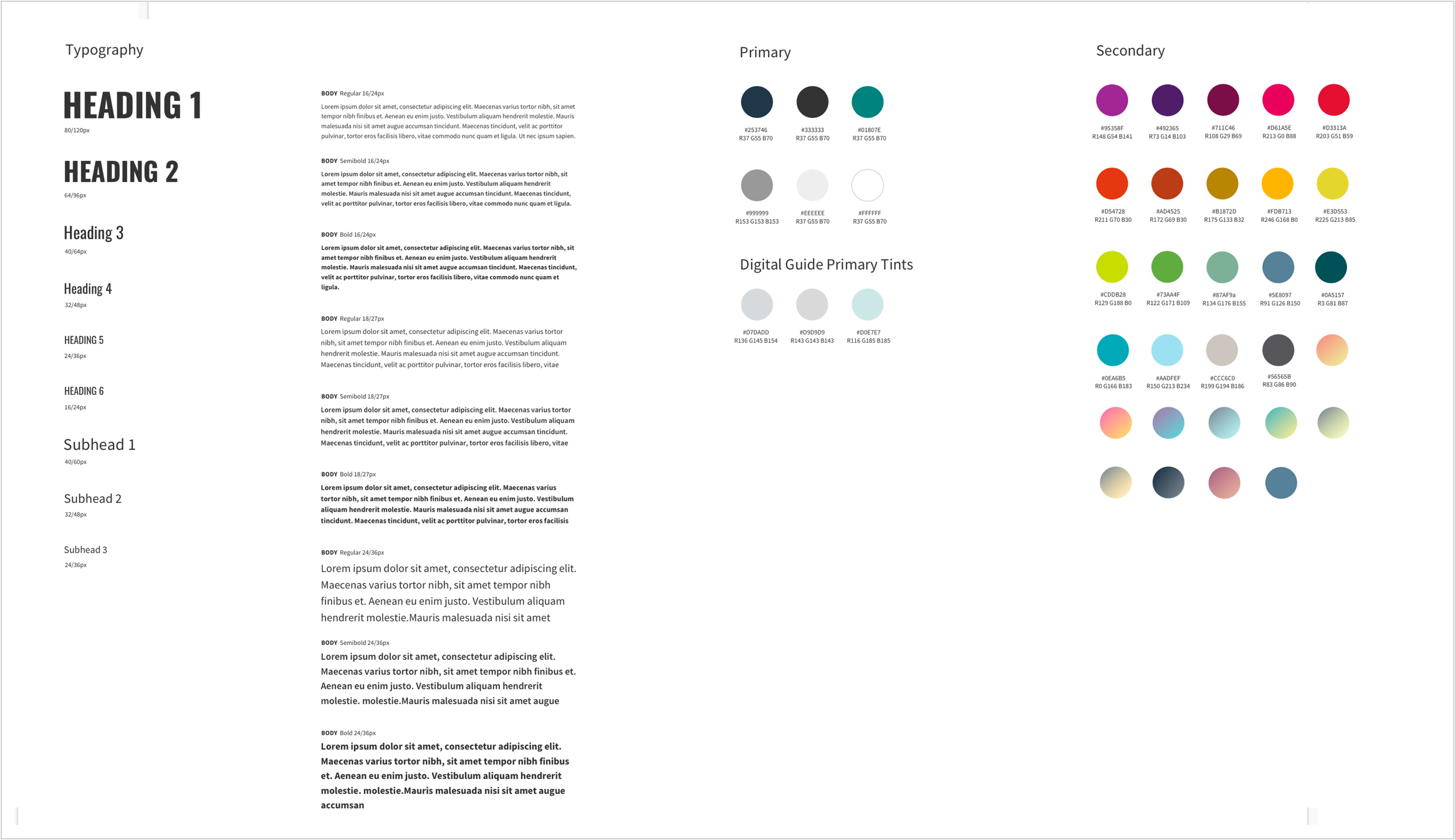
For our design phase we take our wireframes that have been developed and then skin them with the appropriate colors, type treatments, and imagery to make the wireframes come to life. For this client in particular we had a lot of experience with the brand, the brand standards, and overall how they apply their stylistic choices to their design. One unique aspect in how we applied the design is that each page has its own “color lane” that is defined by the path that the user is on (i.e. Manager, New Hire, Benefits, etc.) this gives the user a grounding element within each lane and a cohesiveness to the ovetall branding for the page they are on.
DEVELOPMENT
For our development approach we built a fully de-coupled front-end experience utilizing CSS3 Animations, SVG graphics, Bootstrap and JS. Once built we then modularized the front-end into components that can easily be used and reused in Sharepoint to build pages with Sharepoint custom web parts.
Technologies Used:
- Sharepoint
- Bootstrap
- HTML5/CSS3
- SASS
- jQuery
